Archive for category Web
Which Bitmap Format Is Best?
Posted by baughdesign in Photography, Trends, Web on January 26, 2012
 Many screen capture or save from web commands are defaulting to saving image files in PNG format (portable network graphic). However, the PNG is not always the best format to use when populating a web page or sending an image file.
As an example, the image at left started out at 640 x 304 pixels at 100 dots per inch resolution. Presented as a JPEG ( Joint Photographic Experts Group ) image, the file size is 34KB. The same file, with no discernible difference in quality, stacks up at a whopping 250KB when saved as a PNG. This means that the JPEG loads seven times faster in a web browser … or can be sent seven times faster as an e-mail attachment.
The PNG was developed to supplant the GIF (graphics interchange format). The GIF format has been around since the earliest days of the web, and was often used to represent vector artwork, such as logos. The GIF also offered transparency … where the background of the image dropped out, allowing the page background to “butt-up” to the image, eliminating the square images often found in photographs. One main limitation of the GIF was that it was limited to 256 colors. The PNG went much further, in that it could accurately represent a full color spectrum.
 Let’s compare two pieces of artwork. The image on the left shows gradient artwork saved as a GIF. Because of the 256-color limitation, the image shows severe aliasing and speckling … where the color gamut of the original could not be achieved.
The second image shown is a PNG. Color reproduction is accurate, and there is no evidence of speckling. The improvement in quality of the PNG over the GIF comes at a surprising size reduction. The GIF file shown here is 36KB in size, while the higher quality PNG is only 32KB!
 When file size is important, whether it is to load a web page or quickly transmit an e-mail attachment, consider using a JPEG file rather than a PNG when the image is a photograph. If the image is artwork, the PNG is the hands-down winner over the GIF when it comes to quality and reduced size.
The jQuery Javascript Library …
Posted by baughdesign in Layout Design, Trends, Web on October 17, 2011
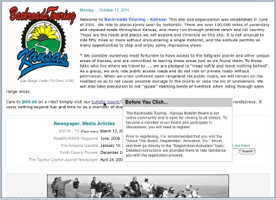 jQuery is the most popular javascript library used in web sites today, with approximately 49% of the top 10,000 visited sites now deploying it.
The library allows for client-side scripting of HTML, and provides a broad range of apps for the designer.
Designed by John Resig, the library provides the tools for animation, enhanced page navigation, widget development, and numerous plug-ins.
The example shown at upper left is known as a ‘Tool Tip’. This script displays a configurable pop-up window that provides the visitor the ability to “hover” over a hyperlink and discover more information prior to clicking through.
Load time is rapid on practically every jQuery script I’ve used so far .. which have included zoomable photo images, image libraries and forms development.
To see jQuery in action, click on the image. It will open onscreen, darkening the background page. Click on the “x” or anywhere off the image to return to the page view.
For additional reading, you might start with the Wikipedia discussion page.
Embedded Google Calendar …
Posted by baughdesign in Layout Design, Miscellaneous, Web on September 27, 2011
An embedded Google Calendar. Using iFrame tags, a master calendar or linked calendars can be placed on any of a number of web pages. An edit to the calendar via Google Apps updates the linked web page(s) with no further intervention needed. Using a Google Calendar also provides their mapping features, which are very helpful to visitors when listing an event location. To see an example of the mapping feature, go to June 10, 2011.
HTML5
Posted by baughdesign in Trends, Web on September 27, 2011
 In 2004, work began on a new web standard, HTML5. The purpose of this standard was to reduce the coding syntax errors that have piled up since the first uses of HTML. Importantly, HTML5 is designed to provide the transition to a uniform means of handling multimedia, such as streaming video, without the need for third party plug-ins such as Flash.
As of this writing, the transition is underway, but not yet completed. A particular sticking point is the acceptance of a universal video format. Several technologies are in the running, and current browsers may or may not support one of the new encoding methods. Initially, page designers will need to provide fallback coding in case an older browser is unable to decode a new multimedia file type.
Once the new standard is firmly in place, we should see better performance, browser stability, and uniformity in web page presentation, regardless of the platform being used.
Cloud Computing …
Posted by baughdesign in Opinion, Trends, Web on September 20, 2011
 It’s shaping into a new world of computing out there, where applications, databases, and communications are being served via an internet connection rather than being produced and stored entirely on an individual PC.
As an example, this site is generated on a “cloud”. The design application, authoring tools and database management applications are provided from and stored on a server in Provo, Utah.
Obviously, “cloud computing” can mean tremendous advantages to IT department budgets, as numerous applications can be deployed across an entire organization without the need for single installations and constant updates to individual PCs. Many of us have been using the cloud for some time, ‘Google Apps’ is but one example of an integrated application system.
But what are the downsides? There are a few that readily come to mind.
- There must be internet connectivity. Lose that, and you lose access.
- Security. If a virus or hacker breaches the cloud service provider, your proprietary information could become compromised or stolen. Click here for an interesting read on the subject.
- Stability. If the service provider becomes insolvent and goes out of business, how to recover?
- Control. While many systems are open source, many others are not. If one chooses to deploy a proprietary system, how much control is lost or hidden costs realized?
There’s no question that technology is moving in this direction, and it will be interesting to see how it all unfolds.
The Costs Of Not Proofing …
Posted by baughdesign in Miscellaneous, Opinion, Print, Web on July 14, 2011
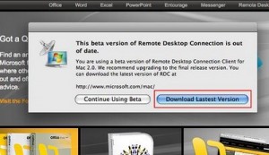 ‘Typos’ (keystroke errors) and spelling mistakes damage your bottom line, particularly when it comes to print and web media. Presenting flawed information suggests to your readership that your organization is not one that holds itself to the highest standards.
In a recent BBC article, http://www.bbc.co.uk/news/education-14130854 the author contends that bad spelling may amount to a 50% loss in internet sales for sites that contain typos and spelling errors.
Given that most word editing programs provide spell checkers, it is hard to understand why many organizations have failed to effectively employ these technologies.
A web page error can easily be corrected in most cases. However, in print those mistakes can prove very costly. A single typo or misspell can possibly result in “dumping” an expensive press run. A public ad that runs with mistakes can cost a small fortune in terms of public relations repair work.
The solution? Proof, reproof, then proof again … preferably with several sets of knowledgeable eyes. The small amount of time spent properly proofing can save not only dollars spent on reworking and republishing the material, it can also eliminate unnecessary damage control costs.
Fresh Content ….
Posted by baughdesign in Layout Design, Web on July 13, 2011
Many web sites remain in a “static” state for extended periods of time. This may be counter-productive, as visitors are seeking something “new” each time they visit the site. One simple way to keep a site fresh and vibrant is through the use of a rotating main image. This is nothing new … Google changes their page appearance daily.
Using javascript, have embedded a series of rotating images that change each time a visitor “lands” on the page. To see how this works, click your browser’s ‘refresh’ button to see the changes.
With simple embedded scripting, a web site can appear “fresh, dynamic and updated” to incoming visitors each and every time they visit.
Web Layouts … Follow The Eyes
Posted by baughdesign in Layout Design, Web on December 7, 2010

Red mapping indicates longest eye pauses, followed by yellow and blue. Gray indicates little to no time spent on these areas of the layout, such as the generic images that have been placed on this page.
An interesting study has been published by Jakob Nielsen entitled, “Eyetracking Web Usability“.
Using monitor mounted infrared sensors, Nielsen’s research studied eye flow and linger times across various web page layout designs to learn what attracted and kept the viewer’s attention, and what did not.
In his findings, Nielsen covers a range of topics … including discussions on photography, navigation, type usage, color, graphics, animations, ad placement and overall layout of a web page.
For web designers and marketers, Nielsen’s work can be a useful tool in determining how best to design a web page for maximum effectiveness.
To read and see more, as well as download a PDF-formatted chapter from the book, go to: http://www.useit.com/eyetracking/ There is also a link on this page for ordering the published work.
Control The Scroll Using iFrames
Posted by baughdesign in Layout Design, Web on August 24, 2010
 One of the least desirable effects of a web page is having a large amount of material that falls below the ‘fold’ … a term that defines the page content that lies below the visible part of a web page display. If there is a high degree of content, the visitor may have to scroll down to an extensive degree.
Part of the problem is that most web pages have their navigation elements (buttons and links) placed above the fold. When a reader scrolls down through the page content, they often lose access to those links and buttons until they scroll back up to the top of the page.
Embedding what is known as an “iFrame” (innerframe) into a web page allows for an image or another element, such as a separate web page, to be inserted into the parent web page. The iFrame tag can be configured to a set width and depth, scrolling attributes, and borders.
In the example above, an iFrame has been inset into the central section of the page and will serve as a placeholder for a dozen or more main content pages. It has been configured to not exceed a specified vertical depth, which means that on most browser resolutions, the entire page fits without needing to scroll. If the main content window contains elements that exceed the iFrame’s specified vertical height, then it allows that window to switch to a scrolling mode. The advantage to this design scheme? Above the fold navigational elements are always visible, regardless of where the viewer has scrolled to in the iFrame, and eliminates the need to scroll back to the top of the page to reach other main topic links.
Web Site Babylon …
Posted by baughdesign in Layout Design, Opinion, Web on January 28, 2010
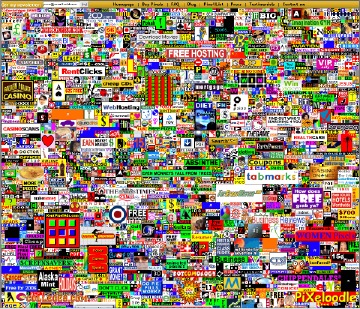 The title of this web site is, “Form Follows Function” … but what does that really mean? Simply, that the site’s mission or purpose is clearly established first (function) … and that the author or designer designs the site architecture or graphical schematic (form) in such a way so as to always “stay on point”.
It is interesting to visit sites that are filled with distractions. Scores of links beckon the visitor to click … but to direct them where? In many instances, the visitor has arrived at a particular site to in order to learn more, but then is distracted away from the primary message, and towards secondary or unrelated focal points. The result is a total dilution of the main message.
For the designer, the addition of links to a particular page should always be weighed as to the overall impact it has on the site as a whole. Does the link add value, enhanced information sharing, or provide search engine optimization? Does clicking a link open a new window, keep the visitor within your site, or replace your content with something distantly related to your visitor’s initial interest?
Keep in mind what has been already shown by the television media. Attention spans have been shortened. Your message must be short, informative, and to the point. Direct the visitor to logical choices, and keep those choices to a minimum.
KISS … it’s a proven acronym that appropriately applies to both page and site design.
Using ‘Google Analytics’ …
Posted by baughdesign in Opinion, Web on January 3, 2010
 I’ve been using the analytical tool, Google Analytics, for some time now. Prior to this point, I had used statistical programs provided by web hosting companies.
The Google application goes well beyond anything I’ve used in the past. The image at left illustrates just one of scores of reports available to the site administrator. Other statistical applications may show the IPs, but Google will break the information down even further, showing demographic information right down to the city level, including time on site and frequency levels. This is just one example of scores of reports available, and all can be downloaded in distributable PDF format.
Setting up a Google Analytics system is very straightforward. The administrator needs to first set-up an account at the link provided above. Google will provide some code that needs to be added to those pages you wish to track. After that, reload the pages to the web server.
Reports are accurate to within 24 hours. I use them for advertising purposes, targeted mailing programs, and search engine optimization (SEO) fine-tuning.
Aspect Ratio / Screen Resolution
Posted by baughdesign in Layout Design, Web on November 4, 2009
 What are web visitors using for a monitor when visiting a web site? How should a page be designed given those parameters?
I recently reviewed these questions on one of my most heavily trafficked sites using Google Analytics.
We’ve seen a growing trend towards what are called “widescreen” monitors. For future reference, I’ll refer to them as “16:9 aspect ratio” monitors. Up to this point in time, all monitors were “4:3 aspect ratio” monitors. The aspect ratio can best be described as a display that is “x” units wide by “y” units tall.
On the site where I gathered data, the results were revealing. In a sampling of 3,000 visitors … 52% were using monitors with a 4:3 aspect ratio, 37% were viewing at a 16:9 ratio, and the rest were viewing at other ratios commonly found on netbooks and cell phones. The most frequently used screen resolution (34%) was 1024 x 768 pixels, followed by 1280 x 800 (14%).
For the designer, it is imperative to create pages that will fit in the widest range of monitors without the need for side-to-side scrolling, which most visitors find quite annoying and can leave a negative impression of the site. The designer should also consider that the visitor may be using sidebars or tabs on their browser, further reducing horizontal window space.
Someday … it will be a widescreen world. For now, consider the numbers and design accordingly!
Gallery Format
Posted by baughdesign in Layout Design, Photography, Web on October 10, 2009
 |
 |
 |
 |
 |
 |
 |
 |
 |
WordPress does not include a ‘table’ tool in its’ tool set, and I needed to show a uniform column and row thumbnail gallery grid within a post. Created a quick 3-row x 3-column table in my favorite web editor, set line depth, cell padding, and dimensions of table. Placed the HTML table code into the post, then uploaded and added individual images into each cell as a linked thumbnail, Thickbox activated.
Embedded Video
Posted by baughdesign in Video on October 10, 2009
Above is an example of a video first authored in QuickTime, then converted to ‘Raw Flash’ .FLV format. I have used this encoding approach rather than dropping a video into YouTube because it provides a much higher degree of control in the areas of image quality, frame rate, and data feed rate.
Not everyone has ultra-high speed broadband, so video content design needs to balance all factors to allow for a quality presentation to a wide viewing audience. You may notice how quickly the video loads, and this is accomplished without the need of a dedicated video streaming web server.
Use Of Typefaces
Posted by baughdesign in Opinion, Print, Web on October 9, 2009
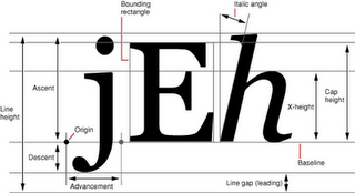 I’ve been around type most of my life. When a young boy, I often watched my father create typefaces by hand. He was the consummate calligrapher, and his talents were sought after by firms all over the country. As an established type and logotype designer, his lessons to me remained clear … type is intended to be read, with little to no need for interpretation.
So …. it never ceases to amaze, seeing what a mish-mash the use of type has become. Both print & web pages are seemingly being produced by individuals who use high resolution screens and possess 20/20 vision …. and often fail to use type effectively .
Why Do They Do This …… ?
• Authors who place type on dark, gradient, or bitmapped image text blocks, reversed out in white or other hard to read color (how natural-reading is that?).
• Small type. Please …. many of us have corrective lenses, maybe even bi or tri focals. Small type was originally designed to maximize the use of trees/paper, reduce printing costs, or hide the truth in legal documents. With the speed of the internet and the ability to display vast amounts of text in near-time, virtual page display space is practically free (and saves trees!). Why not use that space effectively with font sizes that can be read by all without the need of a magnifier?
• Choice of typefaces. Using decorative or script typefaces as body copy is laborious to read. They were designed to be used as headlines, not text.
Here’s a good rule of thumb. Small amounts of text copy …. sans serif faces such as Arial, Trebuchet, Verdana, or Helvetica all work well. Continuous and long stretches of text, serif faces such as Century Schoolbook, Times, and Palatino have proven themselves over the past century as easy-to-read text. Set type in a size that your older readers will have no difficulty reading. Need examples? Look at magazines and books, and see what typefaces those publishers are using. The selected fonts are there for a reason …. maximum legibility.
Thickbox Gallery
Posted by baughdesign in Layout Design on October 7, 2009
This is an example of a Thickbox gallery. Clicking on either the top or bottom thumbnail will result in the launch of an overlay display window. Navigation is controlled at the bottom if there is more than one thumbnail that has been activated. Clicking on a large image will close the overlay window.


