Archive for category Print
Word Processing … LCD
Posted by baughdesign in Miscellaneous, Print on August 11, 2011
 ‘LCD’ for “lowest common denominator”, that is.
I read an article today that reinforces something I’ve done for years … create and/or save word processing documents in plain text format (ASCII). Why? To preserve compatibility with past as well as future word processing apps.
Here’s the story in part …..
Forget fancy formatting: Why plain text is best
by David Sparks, Macworld.com Aug 11, 2011 8:00 am
Looking back through my old files, I’m amazed to see how many word processors I’ve used over the years. I’ve got document files in formats ranging from MacWrite to Pages and everything in between. The problem is, a lot of those old files are useless to me now: None of my current word processors can read them. That’s a shame; some of those old words were pretty good.
Although modern word processing programs can do some amazing things—adding charts, tables, and images, applying sophisticated formatting—there’s one thing they can’t do: Guarantee that the words I write today will be readable ten years from now.
That’s just one of the reasons I prefer to work in plain text: It’s timeless. My grandchildren will be able to read a text file I create today, long after anybody can remember what the heck a .dotx file is.
But that’s not plain text’s only advantage. Text files are multi-platform: I can bounce them among my Mac, iPad, iPhone, and Windows PC without breaking a sweat. I can also drop text into any number of programs for further processing. For these and other reasons, I now write everything—including this story—in plain-text format.
The Costs Of Not Proofing …
Posted by baughdesign in Miscellaneous, Opinion, Print, Web on July 14, 2011
 ‘Typos’ (keystroke errors) and spelling mistakes damage your bottom line, particularly when it comes to print and web media. Presenting flawed information suggests to your readership that your organization is not one that holds itself to the highest standards.
In a recent BBC article, http://www.bbc.co.uk/news/education-14130854 the author contends that bad spelling may amount to a 50% loss in internet sales for sites that contain typos and spelling errors.
Given that most word editing programs provide spell checkers, it is hard to understand why many organizations have failed to effectively employ these technologies.
A web page error can easily be corrected in most cases. However, in print those mistakes can prove very costly. A single typo or misspell can possibly result in “dumping” an expensive press run. A public ad that runs with mistakes can cost a small fortune in terms of public relations repair work.
The solution? Proof, reproof, then proof again … preferably with several sets of knowledgeable eyes. The small amount of time spent properly proofing can save not only dollars spent on reworking and republishing the material, it can also eliminate unnecessary damage control costs.
The Case For Print
Posted by baughdesign in Print on October 9, 2009
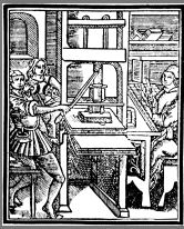
We’ve been hearing about it for decades; the paperless office, electronic books, and all information becoming digital. And, we have come a long ways since the early printing press. Why do we even need printing any longer? Two words: Physical Presence
 The printed document exists beyond the display screen. It can be read during a power failure. It is tactile and enduring. It does not get switched off. And … if the document has perceived value to the reader, whether it’s a well written letter, a good novel or a store coupon, it may be saved for days, months, or years.
When working with clients who are launching a new web site, product, or marketing campaign, my recommendation is usually to include print media in the mix. The web, TV, and radio are media forms that can sometimes flood the recipient with incredibly rapid bursts of information … that can just as rapidly be forgotten. Print media is the one form of media that can be digested thoroughly by the viewer and at times and places of their own choosing.
Print still endures … and for very good reasons.
Use Of Typefaces
Posted by baughdesign in Opinion, Print, Web on October 9, 2009
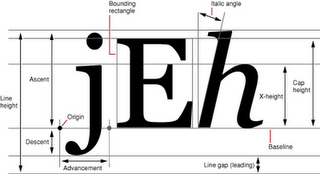
 I’ve been around type most of my life. When a young boy, I often watched my father create typefaces by hand. He was the consummate calligrapher, and his talents were sought after by firms all over the country. As an established type and logotype designer, his lessons to me remained clear … type is intended to be read, with little to no need for interpretation.
So …. it never ceases to amaze, seeing what a mish-mash the use of type has become. Both print & web pages are seemingly being produced by individuals who use high resolution screens and possess 20/20 vision …. and often fail to use type effectively .
Why Do They Do This …… ?
• Authors who place type on dark, gradient, or bitmapped image text blocks, reversed out in white or other hard to read color (how natural-reading is that?).
• Small type. Please …. many of us have corrective lenses, maybe even bi or tri focals. Small type was originally designed to maximize the use of trees/paper, reduce printing costs, or hide the truth in legal documents. With the speed of the internet and the ability to display vast amounts of text in near-time, virtual page display space is practically free (and saves trees!). Why not use that space effectively with font sizes that can be read by all without the need of a magnifier?
• Choice of typefaces. Using decorative or script typefaces as body copy is laborious to read. They were designed to be used as headlines, not text.
Here’s a good rule of thumb. Small amounts of text copy …. sans serif faces such as Arial, Trebuchet, Verdana, or Helvetica all work well. Continuous and long stretches of text, serif faces such as Century Schoolbook, Times, and Palatino have proven themselves over the past century as easy-to-read text. Set type in a size that your older readers will have no difficulty reading. Need examples? Look at magazines and books, and see what typefaces those publishers are using. The selected fonts are there for a reason …. maximum legibility.
